Magazine front cover - Learner response
Magazine front cover - Learner response
FEEDBACK:
Mark out of 15 for Media Language: 10
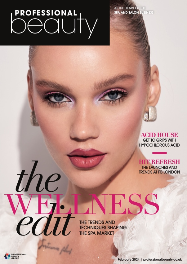
WWW: You’ve clearly researched and planned this magazine which is such an important part of the production process. The magazine itself is clearly recognisable – your production does not stand out massively alongside other Gentlewoman front covers which is a good sign. Your main image – both in terms of the of the initial photoshoot and your Photoshop editing afterwards – is very strong so the challenge now is adding the professional design touches to open up the A*-B grades.
EBI: When deconstructing your cover in some detail, there are a few key areas we can improve on for our real coursework next year. Firstly, font and typography is crucial – you have used a slightly different font for your cover which changes the tone/style of the magazine. Your font loses a bit of the sophistication that the Gentlewoman is trying to convey. Along similar lines, text positioning isn’t quite professional – the word ‘Gurleen’ is not centred between the bottom of the cover and the edge of the image for example. Finally, the text itself is a little inconsistent with real Gentlewoman covers in terms of tone, style and also consistency of using capital letters for example.
STRENGTH:
Good application of knowledge and understanding media language-effective and appropriate selection of elements to communicate clear meaning
To improve and level up i should show deliberate control of connotations
5) What would be one piece of advice you would give a student about to start the same magazine cover project you have just completed?
Focus well on the smaller details aswell as they are noticeable to the examiner eg: font, size and placement of typography.
Comments
Post a Comment